Studying Older Population Patterns Across U.S. States
This study uses state population data to compare how older age groups are distributed across the United States. The data was obtained from the U.S. Census Bureau, Population Division, which provides official population estimates used for demographic analysis.
Source: U.S. Census Bureau, Population Division.
First Study: Scatterplot With All States Included
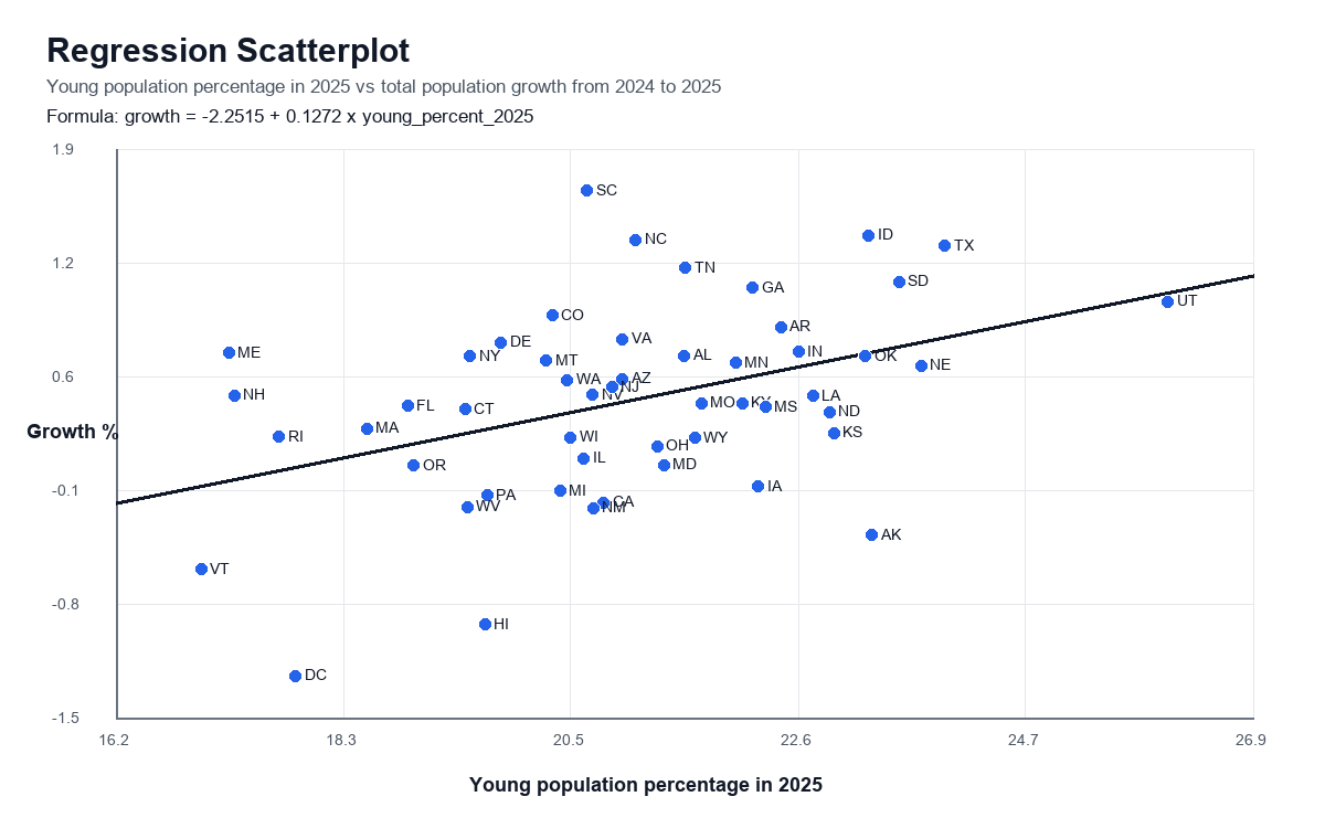
In the first study, I created a scatterplot where every state is shown as a blue dot. This plot included all states without removing any unusual observations. Because every state was kept in the visualization, the plot clearly showed several outliers, including states such as Utah. These outliers were important because they showed that some states have population age patterns that are very different from the general trend.
The purpose of this first scatterplot was to understand the raw relationship in the data. By looking at all of the blue dots together, it was possible to see both the main pattern and the states that were far away from the rest of the group.
The Python code used to create the analysis and visualizations is available on GitHub: view the project code.
Second Adjustment: Removing Outliers and Using a Logarithmic Study
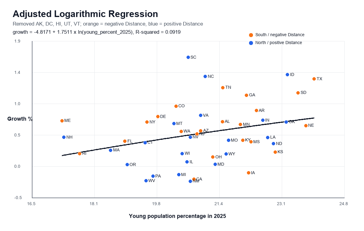
After the first scatterplot, I made a second adjustment to improve the analysis. I considered the distance of each state from the midline, then removed the states that were farthest away from the general pattern. This helped reduce the effect of outliers on the study.
Once the outliers were removed, I used a logarithmic study to examine the remaining states. This adjustment made it easier to compare states that followed the main trend and helped show the relationship in a more balanced way.
Map Study: States With More Older People
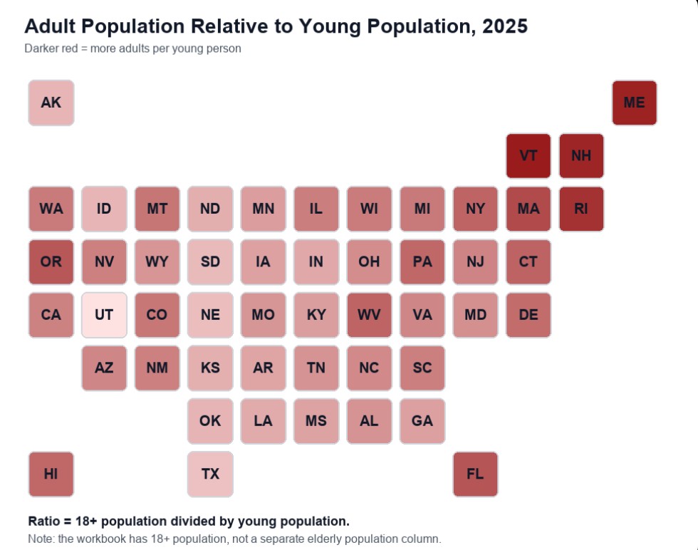
The final visualization was a map of the United States. In this map, red coloring was used to show where there are more older people compared with other states. States with stronger red color represent places where the older population is higher, making the geographic pattern easier to understand at a glance.
Study Disclaimer
This study is intended solely for educational and research purposes to demonstrate the use of statistical analysis and geographic mapping techniques. The objective is to explore patterns within the selected dataset and to develop practical skills in data analysis, visualization, and interpretation.
The findings presented in this study should not be interpreted as judgments, evaluations, or conclusions about any individual, community, population group, region, nationality, ethnicity, or demographic category. The analysis focuses on aggregate data and statistical relationships only.
The study is based on a limited set of variables and does not account for all factors that may influence the observed outcomes. Many social, economic, educational, historical, geographic, and personal factors may contribute to differences in the data and are beyond the scope of this analysis.
Examples of factors not included in the model may include:
- Age and career stage
- Professional experience
- Field-specific qualifications and certifications
- Geographic cost-of-living differences
- Local labor market conditions
- Economic opportunities within specific regions
- Length of residence in a location
- Family and household circumstances
- Access to educational and professional resources
- Industry demand and economic cycles
- Urban, suburban, and rural differences
- Individual career choices and preferences
As with any statistical analysis, the results may be affected by data limitations, measurement differences, reporting practices, and omitted variables. The relationships identified in this study represent statistical associations within the available data and should not be interpreted as evidence of causation.
This project is intended to support learning, encourage data literacy, and provide a visual representation of patterns that may be present within the selected dataset.