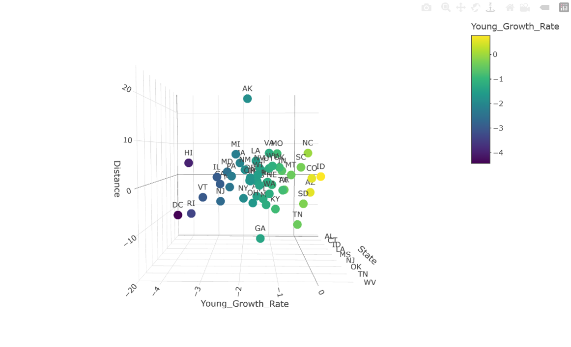
Population Distribution by Age and Distance from Midline
This 3D visualization displays U.S. states positioned according to their distance from the country's geographic midline, serving as a proxy for their relative northern or southern location. States are color-coded to highlight growth rate differences where yellow and purple markers indicate positive and negative growth rates, respectively (see code source).
 Home
Interactive 3D Graph
Back to Studies
Home
Interactive 3D Graph
Back to Studies